Mobile App
User interface design for a home exchange service
Overview
Project Brief
Love, Home, Swap, is a platform for frequent travellers to exchange homes with another person or family, for a vacation, both locally and globally without paying the exorbitant costs of a hotel or Airbnb. The goal is to connect like-minded travellers who are willing to swap their homes, vehicles and amenities with another family or couple for an agreed period of time.
The aim of the brief is to design a mobile app that focuses on the landing screen, registration, and login flow of the app, as well as the in-app screens.
The Problem
Currently, Love, Home, Swap is one of approximately 9 other companies that do direct home exchanges for vacations, without rental costs. These businesses offer very little exclusivity and don’t differentiate themselves from one another. Neither of these businesses have a mobile app, giving Love, Home, Swap the opportunity to tap into another market, extending their reach to mobile users.
Goals
To connect users to the culture of a neighbourhood, through the perspective of a local traveller, offering places of interest, activities and popular dining locations.
To create a user-centric design that’s intuitive and refined for a positive customer experience.
To provide value to our users by understanding their needs and applying relevant content that begins with a tailored onboarding experience.
Delivering users quality listings they’re excited about and can access with ease.
Providing a user-centric approach to in-app communication
The Process

DISCOVER
Researching the problem space and gathering evidence
Introduction
This case study is separated into two distinctive flows. One from the perspective of a guest user and persona, and the other as a home owner, member and frequent user of in-app features. The case study will cover both sides.
Problem Statement
Family homeowners, who live in the city or suburbs, need a low-cost vacation rental 2 to 3 times a year, with convenient access to outdoor activities and places of interest.
How Might We?
How might we help customers’ find vacation homes specific to their requirements?
How might we make it easier for members to secure a house swap and communicate efficiently?
How might we create a more sophisticated visual that gives members a realistic perspective of the home & surrounding environment?
How might we tailor an experience to meet the needs of every member?
How might we design an interface that scales down the most important tasks/information into palatable chunks?
How might we use mobile abilities to add value and give users a better experience?
How might we build an online presence that appeals to [various cultures] and people of different languages?
Long Term Goals
In 2 years time, Love, Home, Swap will tailor their engagement tactics according to behavioral and analytical data.
In 2 years time, Love, Home, Swap will differentiate itself by being the only company with a mobile application, extending their reach to users on the go, with busy lifestyles.
In 2 years time, Love, Home, Swap’s customer retention will increase by 50% through the use of social media.
In 2 years time, Love, Home, Swap will increase user engagement by 40% through in-app features that target users during the most popular booking times of the year.
The Concept
To create a sophisticated home exchange, mobile app, for travelers and families alike, who seek enriching experiences by travelling like a local.
To include features that users can access offline while travelling abroad, such as downloadable maps and directions.
To integrate features that users wouldn’t use on desktop, making communication easier and navigation quicker. Some of which include a messenger app, search bars and filters, image enhancement, geolocation and user feedback.
The app will act as a digital travel guide, where users are able to access activities and places of interest in the area, specific to their location.
Competitive Analysis
The Analysis
Love, Home, Swap is a competitor to 9 other companies that do direct home exchanges for vacations, without rental costs. Neither of these companies have an app. Many of these companies that advertise home exchange services, present themselves in a similar manner to that of Airbnb. Some companies offer direct home exchanges cost free; through point transaction; at rental fee costs or all three. There is no exclusivity, and anyone can create a listing. All mobile websites have a similar look, feel and functionality, as if each one has copied the site before them. The only monetary transaction involved, is a monthly or yearly subscription fee for the service to advertise your home and correspond with other house swappers.
Why Mobile?
The amount of internet browsing that happens on mobile is far greater in comparison to desktop. In 2019, 53% of web access came from mobile phones. Users have more frequent access to their mobiles and with features like geolocation, simplicity in ease of use and multiple search options, mobile exceeds desktop in a number of ways. From a discoverability point of view, users are more likely to discover Love, Home, Swap through mobile, which will entice them to download the app, making usage available to them while on the move, browsing at home or travelling abroad. Users are likely to get the most value out of the app with features like push notifications, in-app messaging to correspond with other members, a digital travel guide for places to visit, places to dine, and access to location based outdoor activities. With geolocation, users can access directions to and from destinations while on the go. By creating an engaging app with features accessible to the user offline, customer retention will increase. Users are time poor, money poor and have a long requirement of needs.
What makes a user choose one app over another?
At the moment there are no apps within this industry, however, when it comes to choosing one company over the other, it’s all in the quality of the listings and photographs, the usability of the app, the guaranteed security of your property and belongings and the response rate to enquiries. The usability of the app offline will be integral to its popularity.
Mood Board
Why I chose to remain on trend
When constructing the mood board, I decided to go for a neutral palette, as this creates a positive customer experience. After doing research on design trends and forming a visual audit, neutral hues and rounded corners were integral in developing a sophisticated design that would outshine competitors. Along with muted tones, I looked for designs that made effective use of white space, making for a clean and refined user experience.
IDEATE
Generating ideas to solve a problem statement
Personas
I chose to use Peter as my persona because he will be the leading user (within his family) of the Love, Home, Swap app. Peter spends the majority of his time on his mobile, browsing the net. He is frustrated at the lack of quality homes available online at affordable prices, and the inefficiency of accessing desktop sites on mobile. Being a family of four, all of whom have their own needs, there are specific requirements on location, activities and accommodation that need to be met. The family is very active, and as such, would need a home exchange in a destination that meets the needs of an outdoor, activity oriented family.
Customer Journey Map
By creating a mobile app, Love, Home Swap will differentiate itself from other competitors by extending their reach to mobile users and offering services and solutions that their competitors don’t. Users will be able to browse for homes according to location, interests, and specific needs without having to rely on a desktop device. The aim of the app is to connect like-minded users and travellers, by delivering a user-friendly communication channel and providing users with an efficient, all in one solution to finding the perfect home that suits their needs, as well as a digital travel guide for all things culture, activity and dining related.
DESIGN
Designing hi-fidelity prototypes and solutions to the problem
Style Guide
I chose to remain on trend by using round corners in my design, making the app more intuitive and user-friendly. By using round corners, you draw attention to the content and not the component, they also encourage friendly interaction, making the experience approachable. Round corners also save space, which offers an effective design solution.
Why I chose these colours
After conducting a competitive analysis, and compiling research on similar mobile apps in the market, it became apparent that muted tones were favoured in primary colour schemes. I wanted to create a sophisticated palette, overall look and feel and the colours I chose played an integral role in achieving this. With pastel hues congruent throughout the in-app screens and an effective use of white space, users are able to navigate with ease, allowing other design elements and imagery to take precedence.
Onboarding
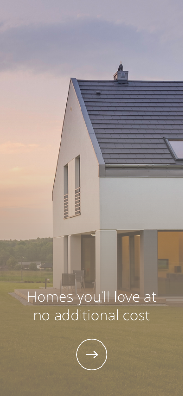
Once users have discovered and downloaded the mobile app, they’re welcomed with a series of screens that introduces the user to what Love Home Swap is all about. The onboarding experience is tailored to accommodate existing users as well as first time users. As a first-time user, Love Home Swap prioritises getting to know the user by understanding where their interests lie and who they are travelling with. By factoring in our user’s needs, the content they’re shown is filtered according to their specified requirements.
Discover and Login
First time users are then given the option to browse homes in various destinations as a guest to get a feel for the app before subscribing to the service that gives you full access. The option to create an account upfront is also available, should the user want to subscribe immediately.
As an existing member, the user can bypass unnecessary onboarding screens and login directly by either entering their details manually or using an existing social media account to sign in on their behalf.
Landing Page
After an existing member logs into the app, they transition to the landing page, where the user is given two options to navigate for homes, “locally” or “internationally”. At the bottom of the screen, is a navigation bar, where existing members can access their profile dashboard, an in-app messenger feature, places - which include activities, dining and attractions, and lastly, homes.
Guest Access allows users to browse freely
Simple login page for existing members
Members only access for tailored navigation
In-App Screens
Travelling locally or internationally
Once a member has chosen whether they’d prefer to travel locally or internationally, they’re taken to two different screens, depending on the path they’ve chosen. Here the user can continue to navigate according to continents or local destinations within your current area
Countries within Continents
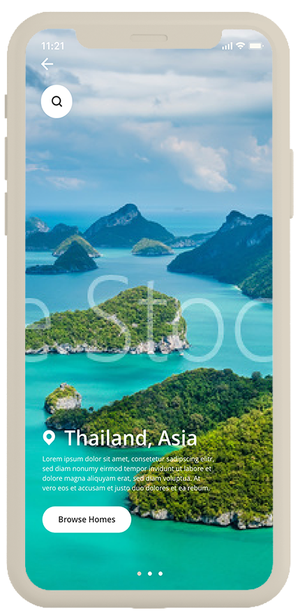
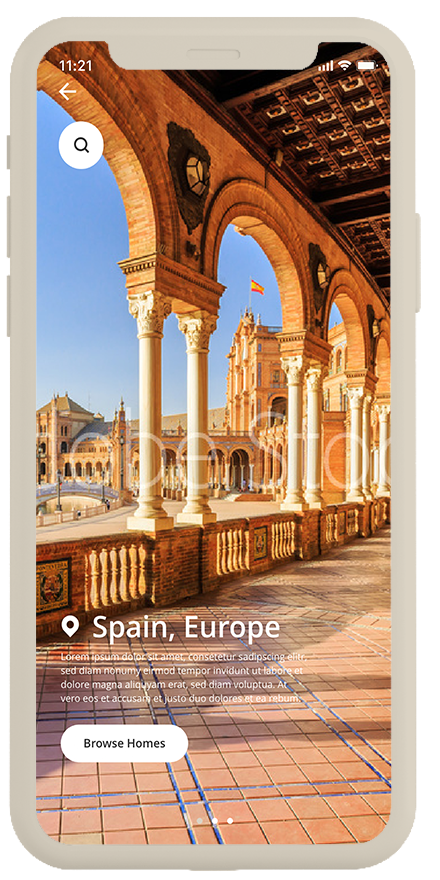
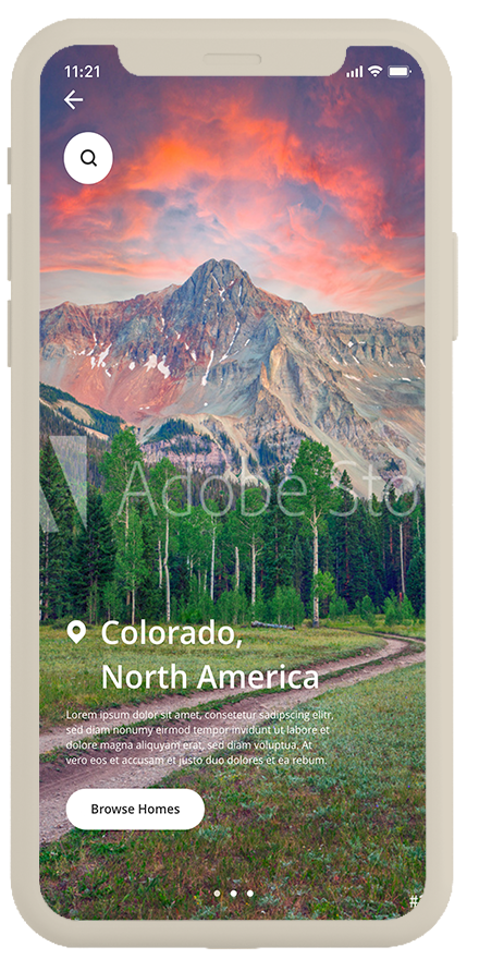
For personas’ Peter and Kate, they’re guest users seeking a summer vacation abroad that offers a plethora of activities to enjoy as a family, as well as cultural attractions and local experiences. Once the user chooses a continent, they’re taken to a series of three screens, covering three different countries within the continent. Should they want to search for a specific destination within the country, the search bar can be used to dive deeper into various locations within the country. As for Peter and Kate, they chose Colorado, North America as their most suitable destination for a Summer vacation because it offers a range of outdoor activities for the whole family.
Home selection catalogue
Once Peter and Kate have decided on a country, they’re taken to a catalogue of homes specific to their chosen location and requirements. “The Home’s in Colorado” page allows the user to scroll through a series of homes that meet their requirements. Using the filters at the top of the page, users can scroll and select what amenities and facilities they’d like, which will narrow down the choice of suitable homes even further. Each home slide gives a summarized view of what amenities are included. By having this summary, we’re helping users find homes that meet their specific requirements quicker, that way users can prioritize which homes to focus on.
Virtual Property Tour
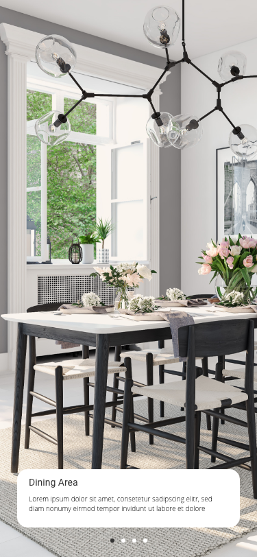
On making a home selection, the user is given a virtual tour of the property, room by room, through a series of images and videos. When it comes to Peter and Kate, it made sense for them to choose a modern 4 bedroom home in Aspen, Colorado, as the location caters to a variety of outdoor family activities that are convenient to access. Coming from a small apartment in London, Peter and Kate were looking for a home that is spacious, which is exactly what they found in Aspen. The home caters to their family’s needs by having large, open planned living spaces, a garden and swimming pool for the children, as well as a gym for Peter and a laundry to keep up with the needs of their children. Being an active family, the house was suitable for everyone.
Should the user like the home, they can see more details about the property, which includes a short description, list of amenities, available dates for the user to select, an approximate location and an option to “request an exchange” with the owner of the property.
Exchange Confirmation and Feedback
After users have requested an exchange with another homeowner, they’re propositioned for some in-app feedback, that way Love, Home, Swap can continue to improve the user experience by adding and improving features and dropping elements of the app that aren’t working. Feedback from users is insurmountable in value. Not only does it give the company have an opportunity to see a customer journey from a user perspective, feedback can be useful in marketing material for social media pages. This creates transparency between users and the company as well as visibility on social media, which leads to trust and increased retention.
Subscriptions
Should the user find their experience as a guest, positive, they would need to subscribe to Love, Home, Swap to access its full services. Users are prompted to sign up after they have spent a certain duration browsing through the app and understanding its benefits, therefore it makes sense to prompt the user at the point of them requesting an exchange. Users are given two options, a monthly or yearly subscription, both of which are of different price points. Now that Peter and Kate have taken the time to explore the app as guests, it makes sense for them to become members, with their goal being to travel abroad 2-3 times a year.
From Guest to Member
Now that Peter and Kate have subscribed, they’ll be able to utilise all in-app features which will be covered in the next flow, however, to successfully guarantee a home exchange, the next step for users will be to create a listing of their own, which will be made available to other members as a home exchange option, should both parties agree.
Create Your Listing
As a user becomes a Love, Home, Swap member, in order to participate in the home exchange program, they need to list their property onto the app, which will appear as a viable property for home exchange among other browsing members.
As for homeowners Peter and Kate, they’re interested in listing their secondary holiday home instead of their primary residence, as this way, they can guarantee the safety of their belongings and not have to go through an intense period of preparation and reorganisation for a house exchange 2-3 times a year. With two busy, young children, using their primary home to create a listing would be a lengthy, time consuming process, which they would rather avoid. Not to mention, their secondary home is far more spacious, lies in the local countryside and would be an idyllic place for travellers seeking a reprieve from city living.
Contents Page
The “List your space” screen summarizes the various sub-categories the user would need to complete before their listing goes in for review. The process has been designed as concisely and efficiently as possible, however, the user is able to complete each stage at their own pace, without losing progress.
Reasons behind images and videos
I placed emphasis on uploading high quality images and videos, to secure the success rate of home exchanges. High quality images show an element of sophistication and professionalism. If the quality of the images are poor, this negatively impacts the high standards Love, Home, Swap upholds, as well as the users they’re trying to attract and retain. Should the property pages be of average quality, the company cannot differentiate itself as the stylish, leading property exchange group on the market.
Upload Images and Videos
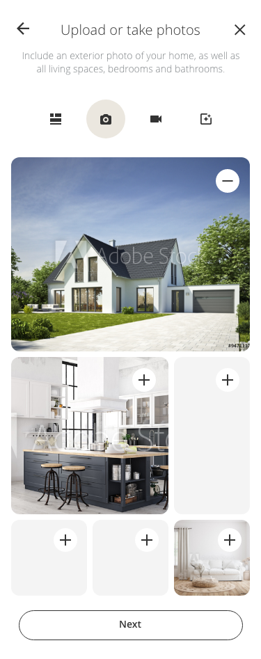
The first category on the contents page focuses on images and videos, which consists of five screens, namely choosing your display grid, uploading images, uploading videos, inputting descriptions and lastly, adding filters. The reasons behind including options of customization at every point, is to ensure congruency throughout the user’s property page, so as to avoid false advertising or appearances. Using customization tools also gives the user the opportunity to personalize their experience, making the process of uploading a listing more enjoyable and more importantly, making it their own
Icons
At the top of each screen, is a series of icons representing the different stages of the process. Users can navigate through the five screens easily by tapping on the icons. On the first screen, users are prompted to create a display grid of their choice by removing and adding blocks as they see fit. The display they settle on, will be a template for how their listing appears when it goes live. As the user enters the page, they’re greeted with a series of tips to help them successfully complete the task.
Once the user has selected their display grid, the next step involves uploading or taking quality images of their property. Should the user be unsure how to take or upload photos, there are tips on how to achieve the optimal photo when the user initially enters the screen.
Description Field
The third screen is used as a description field for the uploaded photographs. Here the user can describe each photograph using only essential information, that’ll aid as a caption. This is an important step to include when differentiating rooms from each other. It also gives users the option to scan through a series of important details speedily.
Video Footage
The fourth screen involves uploading video footage for each of the rooms and living spaces within the property. This will give other members a realistic perspective on the property they’re inquiring so as not to be surprised or disappointed on arrival. Once again, users are given tips to aid in a successful upload.
Adding Filters
The final screen is the “add a filter” page. It links to both the second and third screens. Once the user has uploaded a photo or video, they’re given the choice to add a filter onto their selected image. The reason behind including a filter feature, is to improve image and video quality, should the user require it. It is also a chance for the user to express themselves.
Define your property
Once the images have been uploaded, users are asked to define the type of property they have. This will make it easier for members to filter through homes according to their requirements, enabling them to reach their goals quicker. Sharing as many details about the property being listed will give the user a higher inquiry and request exchange rate. In Kate and Peter’s case, they’ve defined their property as a secondary home, that boasts a Modern Farmhouse Style, located outside London in the countryside. The house sleeps six people, is very spacious and is child friendly.
Bedrooms
The next set of screens covers the type of bed each room has on the property as well as the number of bathrooms. This will make it clear to guests how many people can be accommodated at one time.
Residential Address
The residential address screen is imperative to complete, as members won’t be able to view a property without knowing its location, however, the exact residential address will only be disclosed once a member has confirmed a home exchange. The address will be made available a few days before departure, for safety and privacy purposes.
Amenities
An amenities page is pivotal in a users’ listing. This is an opportunity for users to differentiate themselves from other properties in a similar location. Users can apply amenity filters to narrow down their property search. For a user’s property to stand out, they’ll need to disclose as many amenities as possible. Users with particular needs may require specific facilities and amenities, which will make a listing more of a viable option if they’re listed. I designed the amenities in the form of a button, making it as efficient as possible for the user to complete their tasks without too many input fields.
If you take Peter and Kate’s children into account, they’re both very active and love to swim, therefore, Peter would most likely favour properties with pools or hot tubs among other requirements on his list. Should the user want to complete their listing at another stage, they have the option of doing so by selecting “save changes and continue later”.
Describe your listing
Describe your listing is one of the most important screens, in that it gives the user the opportunity to add any important details necessary for guests to know, as well as the opportunity to paint a holistic picture of the property. By giving their listing a title, members can make their property stand out.
Availability
On the availability screen, I designed it in such a way that would make the process of lengthy tasks as efficient as possible. Instead of using input fields, I chose to use toggles and radio buttons for non-negotiables and preferred methods. Users are able to slide through calendar months and select dates with ease before moving onto the next screen.
House Rules
On the house rules page, I’ve touched on cultural sensitivity. I think this is an important feature for users to have, should they have specific requirements of their guests. It also creates inclusivity of various cultures across the globe.
Listing Preview
The final screen in the listing process is a preview page of what the users listing will look like. This gives users a clear outline of how they’ve completed every step, what they might be missing and how their listing will appear to other members when it goes live. It gives the user an opportunity to go back and improve certain aspects before finalizing their property page.
With their listing complete, Kate and Peter are now active members of the “Love, Home, Swap” app, which gives them access to all in-app features and other benefits that members receive on completion of their listing. Kate and Peter can update or change their listing as they see fit, once their listing has been reviewed and uploaded. This includes changing their availability, adding or editing features, planning future house swaps and communicating with as many members they like. As long as they remain members, they can utilise all the app has to offer.
Member In-App Screens
Profile Screens
Now that Kate and Peter have become members and created their profile, they have access to their dashboard. Here they’re able to view requested home exchanges, upcoming house swaps, cancellation policies, among other features within the app, which can be accessed through the “profile” tab on the nav bar. Throughout this series of screens, users can locate their chat history and homes and activities they’ve ‘favourited’. Should the user want to view details on their upcoming house swap, they simply click the ‘upcoming’ button on the screen, which will load the ‘booking confirmation’ page. Here the user is shown details on arrival and departure, check in procedures, current climate at their upcoming destination, as well as the physical location of the property (only to be revealed on day of arrival).
Bottom Nav Bar
The bottom navigation bar appears to users who have created an account with Love, Home, Swap. The bar consists of five icons, namely, “profile”; “messenger”; “burger menu”; “places” and “homes”. The reason I chose these icons is for ease of navigation, giving users access to the most frequently used in-app screens needed to achieve their goals of finding a property, requesting an exchange, communicating with other members, creating a listing and finding activities. The function of the burger menu is to transition the user to a menu that provides a list of contact points for the user to access, should they need more information, additional help or means of navigation.
In-App Messenger
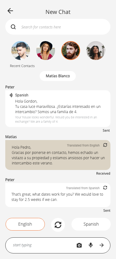
It was important to design the Love, Home, Swap app in such a way that it would be inclusive of users from varying cultures and languages. With the universal user and traveller in mind, I decided to design an in-app messenger feature that translates text into varying languages, upon detection of your chat recipient’s native tongue, which the user would have disclosed when setting up his or her profile. Should the user want to refer back to the original text before translation, the clickable icon in the top right-hand corner of the chat bubble will translate the text back to its original form, that way, the user is able to follow the thread of conversation easily, without confusion. By offering this service, members from different parts of the globe are able to communicate more effectively and there will be an increase in home selection from foreign destinations.
Places
“Places”, one of the icons on the navigation bar, is where users can access activities, dining and attractions relative to one’s current location. Taking my personas into consideration, they’re a family of four who enjoy being active. Hailey and Ryan, ages 10 and 6 respectively, are incredibly energetic, and need to be kept entertained. Peter enjoys hiking, water sports and trail running, while Kate enjoys cycling. Aspen, Colorado seemed like the perfect Summer vacation destination for the whole family.
Upon entering the screen, the user is able to apply further filters to narrow down their preferences. Should the user be interested in “hiking”, they simply select the activity of interest, which takes you to a scroll screen of various hiking activities in the area. If the user is looking for a specific activity, they can try locating it in the search bar above.
Activities Within a Category
Once the user settles on their chosen activity, they’re given the option to use the in-app map feature which will direct the user to and from the activity location. The map will pan out the route according to the user’s method of transport. Should the user be out of range to a wifi connection, they’re able to download the directions to use offline. The same method explained above applies to dining and attractions within the area.
Homes
The next icon on the nav bar is “homes”. As a member, instead of going through the initial flow of destination screens that appear after the home page, the user has the convenience to directly filter through homes according to specific requirements or categories. By using the search bar at the top of the screen, the user can choose their location of choice. Another option the user has, is to utilise the pre-categorised properties that fall under “family oriented”; “most popular” and “type”. Towards the top of the screen, is a filter scroll, where the user can select additional filters that cover amenities and facilities to narrow down their search instead, should they want to forego using the sub-categories. For more specialized requests, the user has the option of the advanced search filter in the right-hand corner of the header. For personas’ Peter and Kate, it made sense to include a ‘family oriented’ filter, as well as facilities such as ‘pool’ in order to cater to the requests of the children.
Closing Summary
Peter and Kate have come to the end of their customer journey on the Love, Home, Swap app. Throughout the varying flows of the app, they’ve been able to experience what it could be like if they were to travel. The app has aimed to provide the pair with value that is enriching to their home exchange experience. They started off as guests with browsing access, to subscribing and becoming home exchange members. Their journey followed three distinct flows, the first flow allowed them to familiarize themselves with the app and what it has to offer, the second flow focused on creating a listing and the third flow centred around member in-app screens where they could view their upcoming listings, access their dashboard, use the in-app messenger, scroll through active chats and search for places and homes relevant to their location. For Peter and Kate, the app helped them achieve their goals by giving them a tailored experience in line with their preferences required for a young, active family. They were able to locate a suitable family home in a location that met their active lifestyles, Peter’s desire for water sports and culture, Kate’s need for family oriented activities and Ryan and Hailey’s need for open space, a warm climate and plenty exploration.
The Love, Home, Swap mobile app was created because there were no home exchange apps in the market and the company wanted to extend their reach to mobile users. The overall goal was to create an intuitive and user friendly app that met users needs from the perspective of a local traveler, by connecting users to the culture of a neighborhood. The app achieves this by acting as a digital travel guide in reference to the user’s current location, whether it’s for directions, activities, dining, culture or accommodation, there is no stone left unturned. The user is left with a fulfilling, stress-free travelling experience.
Prototype Video
The video takes you through the hi-fidelity prototype of the website to show how the various screens and elements interact.
Prototype Recording / Flow 1 / Guest Experience
Prototype Recording / Flow 2 / Create a Listing
Prototype Recording / Flow 3 / Member In-App Screens


