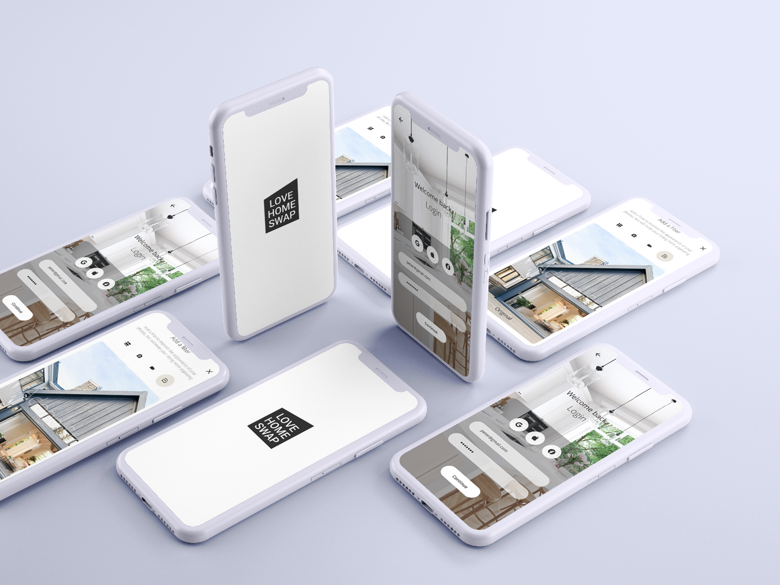
Love Home Swap
A User interface design for a home exchange service.

An Overview
-
A brief overview of the project
-
Research, testing, scoping and branding.
-
High-fidelity designs
-
Reflections and next steps
Overview.
What is Love Home Swap?
Love, Home, Swap, is a platform for frequent travellers to exchange homes, vehicles and amenities with another person or family, for a vacation, both locally and globally without paying the exorbitant costs of a hotel or Airbnb.
Role
UX Research
Affinity Mapping
Wireframing
Project Scoping
Branding
Prototyping
Problem Statement
Leisurely travel poses a significant financial burden on families who rely on airbnb’s and hotel stays. Love Home Swap’s reach is poor and customer retention low.
Goals
To connect users to the culture of a neighbourhood, through the perspective of a local traveller, offering places of interest, activities and popular dining locations.
To create a user-centric design that’s intuitive and refined for a positive customer experience.
To provide value to our users by understanding their needs and applying relevant content that begins with a tailored onboarding experience.
Delivering users quality listings they’re excited about and can access with ease.
Providing a user-centric approach to in-app communication
Who are the users?
A family of four consisting of a psychologist, a general practitioner and two children under 10 years of age.
The Process.
Key Insights
Currently, Love, Home, Swap is one of approximately 9 other companies that do direct home exchanges for vacations, without rental costs. These businesses offer very little exclusivity and don’t differentiate themselves from one another.
No mobile apps, within this space exist, giving Love, Home, Swap the opportunity to tap into another market, extending their reach to mobile users.
The amount of internet browsing that happens on mobile is far greater in comparison to desktop. In 2019, 53% of web access came from mobile phones. Users have more frequent access to their mobiles and with features like geolocation, simplicity in ease of use and multiple search options, mobile exceeds desktop in a number of ways.
How Might We…
Break down preventative care into small chunks that users are able to adopt daily?
Help women better understand what factors affect their self-care routines and help them build the right routine for their needs, age, and lifestyle?
Create solutions based on a holistic approach to wellness?
Equip women with the knowledge they need to make informed decisions about their health and keep them accountable over time?
Educate and encourage users to prioritise gut health as a preventative measure for healthy ageing?
Educate users on the importance of mental and physical wellbeing, and make it easy for them to adopt daily?
Process.
Four Concepts
° Understanding your gut health
° Accountability & Gamification
° Holistic Approach to Ageing
° AR Face Recognition
Takeaways
Conducted 5 user interviews
Testing was inconclusive as to what features to include and let go of.
Unclear whether to focus on one specific area of anti-aging or a select few.
Lo-Fi Prototypes /
Process.
One Flow
Inconclusive
To focus on one or two areas of anti-aging or multiple areas.
How the social aspect of the app will translate.
Whether to include the bottom nav or burger menu or both.
Is an in-app messenger necessary?
/ Mid-Fi Prototypes
Incorporating the best features from all low-fi flows
Process.
° Gut Health & Skincare for anti-aging
° Tailored programs for every individual
° Daily and monthly goals
° Progress bar for accountability
MSCW Features & System Map /
Solutions.
/ Create a Listing


